Comparing Animal Sightings in Williamsburg
By Gelila Yimtatu and Tiffany Nguyen
A Wild Introduction
Have you ever wondered what types of animals roam your William & Mary campus? Are you curious about the different behaviors and habitats of these creatures throughout the year? We the authors, Tiffany and Gelila, have sought to answer these questions by conducting a study of the wildlife present on campus during both winter and spring this year. By gathering data on the types of animals present, their locations, and behaviors, we aimed to create a comprehensive understanding of the diverse wildlife thriving in our environment.
The inspiration behind this project was Georgia Lupi and Stefanie Posavec’s “Dear Data” project, where they explored the variety of data visualization through a unique approach. The two designers exchanged weekly postcards in which they documented and visualized different aspects of their daily lives. Each week, they choose a different theme, collect data, and transform it into hand-drawn visualizations. In Dear Data, they exchange these weekly visualizations as postcards which consist of creative representations of aspects of their lives. We have mimicked their approach and each created our own hand drawn visualizations of the data. Both of us presenting our unique findings gave us insight into the different perspectives and approaches we each took, leading to a richer understanding of our data!
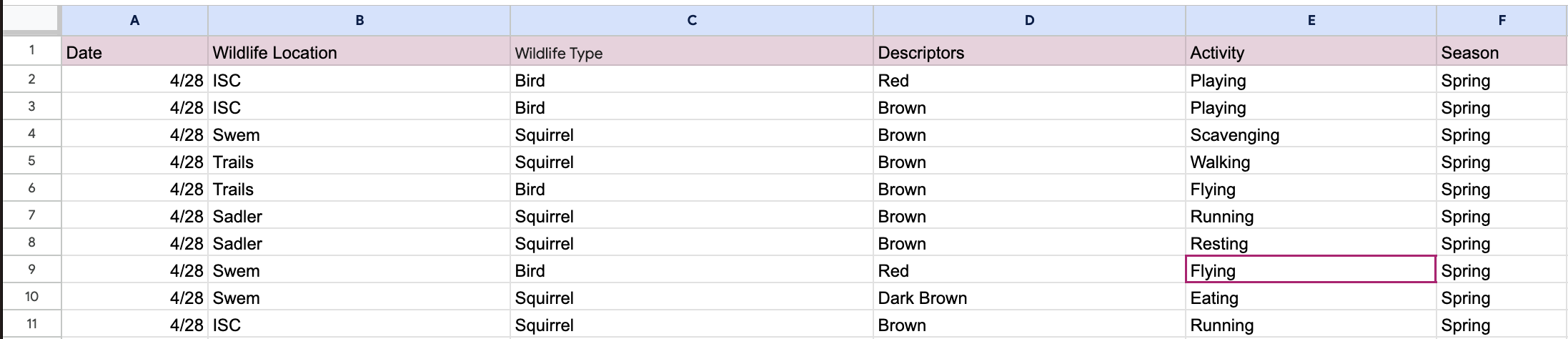
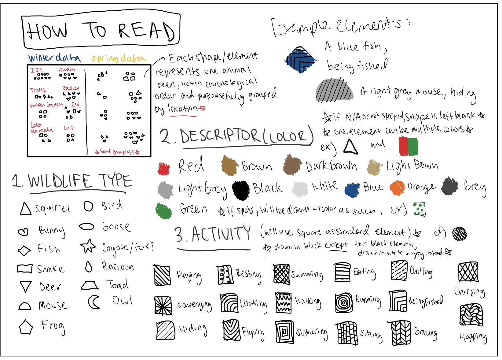
We are researching where we see wildlife on the William & Mary campus. This includes looking at the animal type and actions of the animal as well. In our data, we numbered each animal we see in order as well as mark what day we saw it, and we also have descriptors for each animal if we don’t know the exact species it belongs to. Here is a snippet of our data: our first eleven entries.
Through careful observation and analysis, we were able to create detailed hand-drawn visualizations and more graphs that provide insight into William & Mary’s fascinating campus wildlife. Our aim in this website is to show you how the choice of visualization techniques can significantly influence your perception and interpretation of the data. Scroll on and see how we showcase different visualization methods and highlight certain selections of chart types, colors, labels, etc. to receive different insights. Join us as we take a closer look at what we found!
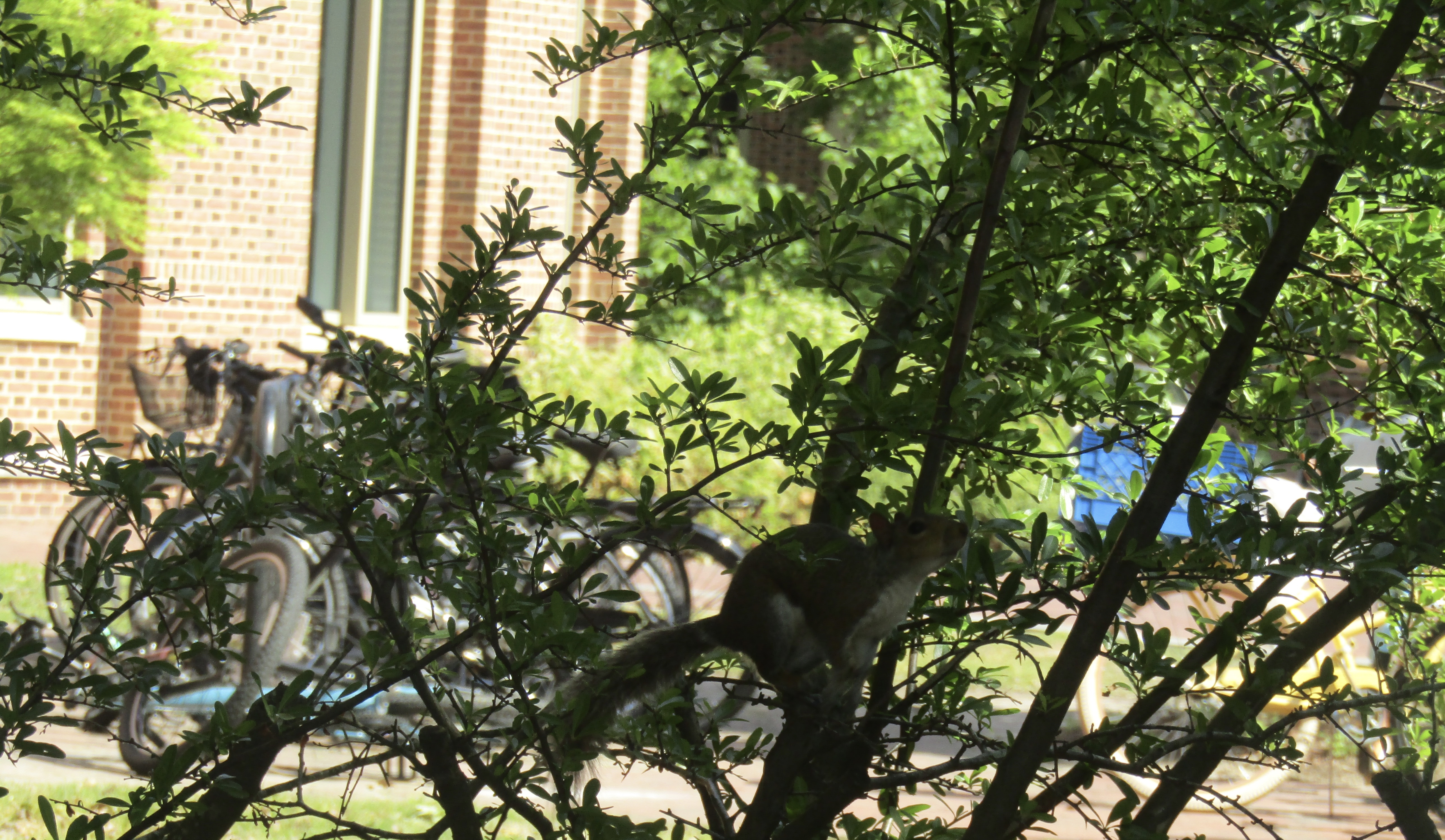
Pictures of Some Animals

Squirrel
ISC
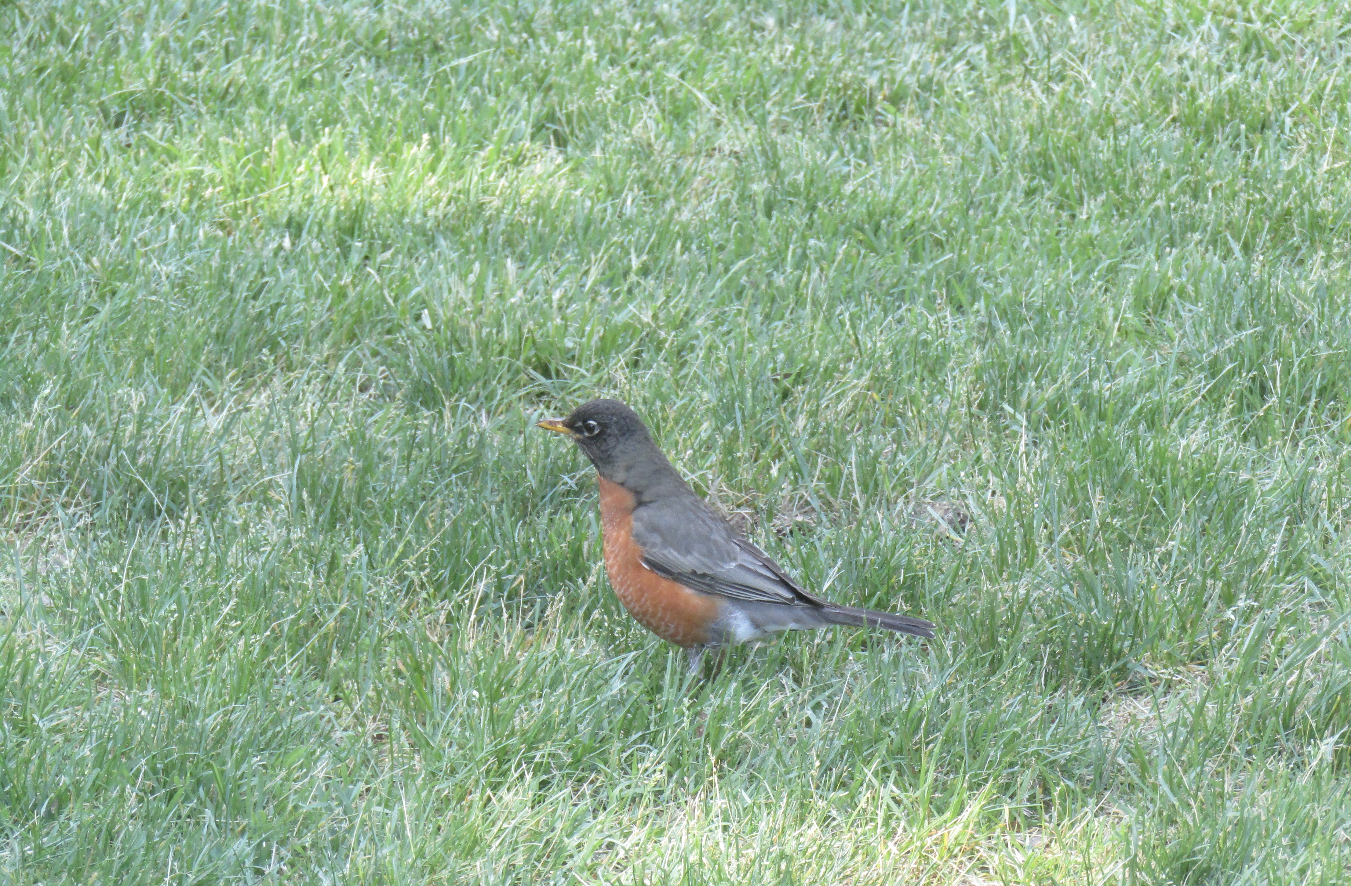
Bird
Swem

Squirrel
ISC
Squirrel
ISC
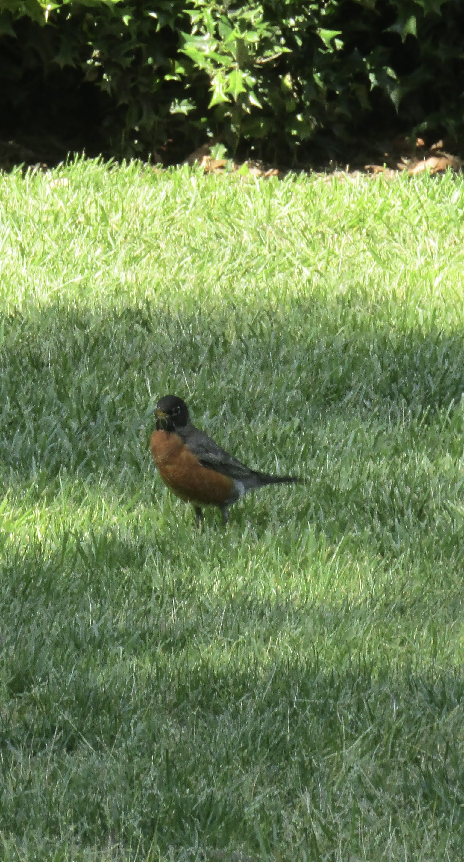
Bird
Sunken Gardens
Some Graphs
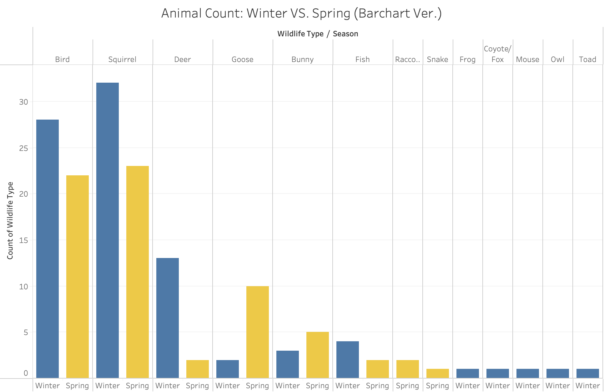
The bar chart presented here showcases all the animal counts side by side for each season winter and spring. The primary objective behind selecting this graph is to allow the audience to discern the dominant animal species in each season. Upon close observation, several noticeable trends emerge from the chart. For instance, during winter, squirrels, deer, and fish are more prevalent than in spring, while in the latter season, birds, geese, and bunnies have a higher occurrence rate. Let us look at the data in a heatmap.
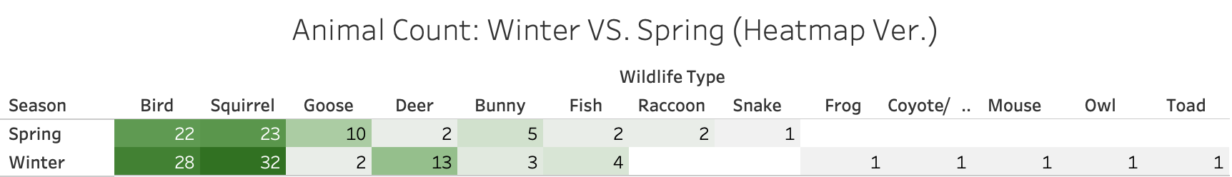
This heatmap uses color gradient as a tool to draw a viewer more to the animal type with the most amount of spottings: squirrels! Blank entries indicate no sightings of said animal type during that season. Notice that we only see a select few, specifically birds and squirrels, with high color concentration. How do these two animal groups compare with the others?
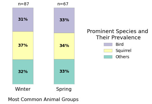
Woah! We knew we had a lot of data on squirrels and birds, but now we can really see how they really dominate the data, basically dividing it into thirds. During the winter, squirrels took the lead followed closely by the birds. This suggests that squirrels were particularly active during this month, which is as expected, because as the colder seasons come squirrels gather and store food before scarcity. As spring came so did a rise in the bird population, as they migrate back and perhaps start breeding! With this graph, we get a glimpse into wildlife activity influenced by factors like migration patterns and mating seasons.
Interactive Graphs
Let us see the patterns in activity when it comes to our most prevalent types. This is a parallel categories plot, which is fitting for our data since it consists of majorly categorical data. Patterns can be easily spotted through the large ribbon chunks.
Under ‘Others’ in ‘Type’, it makes sense that the ribbons get smaller because it counts a variety of animal activity. Clear and expected patterns include the most popular activity for birds as flying and for spring squirrels as running. One good thing about this chart is that you can see how these vary for each season. For instance, during the winter, there is a noticeable reduction in the variety of activity options across all groups. However, during the spring, we observe a significant increase in animal activity options.
These two folium maps show the prevalence of the amount of animals in each location in the two different seasons, and when pressing on the bubbles you can see the amount of animals sighted in the location. We can see that in the winter there was significantly more animals, but why is that?
Well there are many different factors that come into whether or not animals come out. We observed some unusual patterns in the weather these past couple of months, with the winter being warmer and the spring being colder with harsh rains. We can also see in the spring there was a concentration of animals in common eating spaces like Sadler as many animals were scavenging around that time.
Doodling the Data: What animals do we encounter in the winter versus the spring?
.jpg)
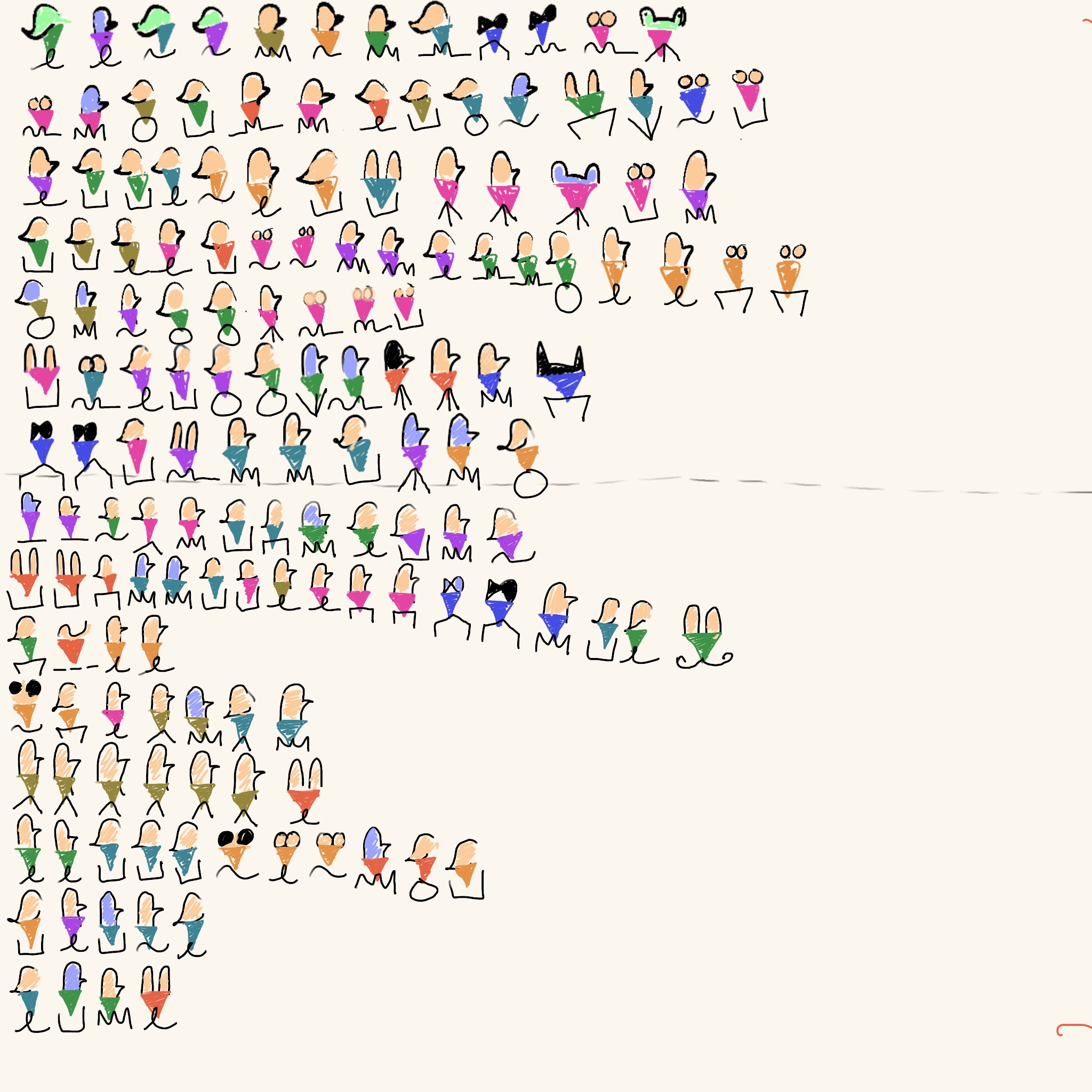
Tiffany : "When making this data visualization, I knew we had a lot of categories for each subquestion, so I wanted to tackle it in a way that would reveal patterns. For example in our descriptor column, we had a lot of miniscule details, but I wanted to see if there was a pattern between vibrant and more neutral colors, as well as if we only had a more physical descriptor of the animal. I also decided to group the birds together, for example the geese and owl were just categorized as 'bird'. This made it easier to see the type of animal that was more prevalent."
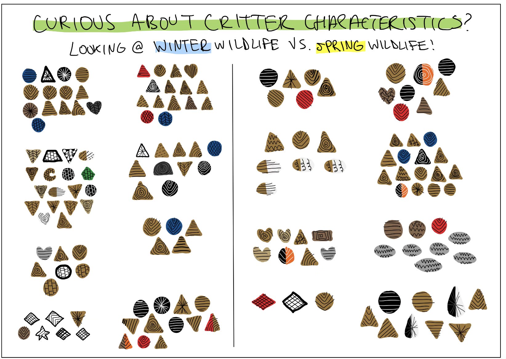
Gelila: "My goal in creating this visualization was to prioritize pointing out physical characteristics. I thought it would be more fitting to put in this hand-drawn visualization than a python or Tableau-generated graph. Things that I can spot immediately include that the majority of the observations were brown, whether it was dark or light brown, and that animals are mainly squirrels and birds (triangles and circles). One thing with this visualization that I did not notice before was that you see more variety in multi-colored animals in the spring than winter!"
Drawing Conclusions
Through both of our visualizations, we can see that there are a lot more neutral colored animals, and that a majority of the more colorful animal animals are seen through the birds. Also, for both visualizations you can clearly see that there are less animal sightings in the spring than the winter. Some insight: during this week of spring it was raining a lot, so sometimes we both would not go outside, and even when we did go out in the rain, we would not see as many animals. One difference between the way we displayed our graphs was our grouping. Tiffany’s is grouped by days but Gelila’s is grouped by location. When comparing the two, it can be observed that Gelila was more focused on specifically representing as close to the animal as possible, while Tiffany's focus was more on capturing the essence of animals through her drawings rather than emphasizing colors. Note that we both presented our own representations of the same data, although they look very different! While we are proud of the insights and visualizations we have produced, we also acknowledge that there may be limitations and areas for improvement in our study. For instance, our data collection was limited to the winter and spring seasons, and it would be valuable to expand this research to cover a broader time frame throughout the year. Additionally, the use of descriptors for unidentified species highlights the need for further research and identification methods to enhance our understanding of the animal populations on campus. All in all, our study sheds light on the captivating wildlife present on the William & Mary campus, offering a glimpse into their behaviors, habitats, and interactions!
The Authors

Tiffany Nguyen

Gelila Yimtatu